Are you looking for the latest Twitter header sizes? If you are, then you are in the right place. In this guide, I will take you through the latest Twitter cover sizes and also provide Photoshop templates for free, so that you can save a ton of time. This post goes into different aspects of building a visually appealing Twitter profile that also stays loyal to the brand’s vision. If you are a marketer or a designer looking forward to this, I guarantee, you will not be disappointed once you finish this post. Let’s get started!
The last change in Twitter’s cover image dimension has made it responsive and also increased the scale of the profile picture. One of my old posts from a year ago mentioned those changes, but this time, I wanted to do a deep dive into the design guidelines and make it clear for you to get started in optimizing your Twitter profile for maximum visual impact.
With the new layout of the profile, you will have more flexibility in displaying images on desktop and mobile as the cover image is responsive. With a bigger profile picture, the profile looks more visually appealing now.
Twitter Header Sizes -Taming the Ever-Changing Monsters
Yes, I called it a monster because the size keeps changing and it’s hard to predict how and when it will change. The last changes were picked up very late by most users leaving them with blurred header images for a few months if they had not been updated.
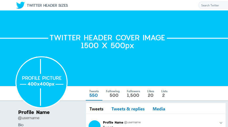
The new Twitter header size at full width is 1040 px at the lowest resolution screens. Before you jump right away and load up your photoshop or gimp, let me warn you something. Don’t design for the minimum size!!!
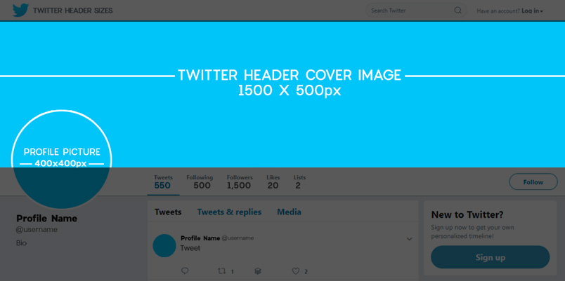
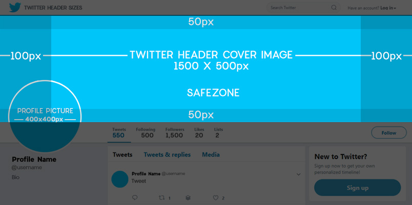
They are responsive and will scale to bigger monitors and resolutions, but will be blurry due to lack of pixel resolution. In order to get the header size right, you need to design them in the dimensions of 1500px X 500px and try to keep the dpi to 150dpi in a raster program like Photoshop. I would suggest that you leave 150px to 200px padding on both the left and right of your header for Twitter. You could use the following technique to create an image that works well with the new Twitter header dimensions.
Create a canvas or document size of 1903px wide and 605px in height. You can then place your 1500px by 500px cover image into this document to create padding on all sides. This will prevent cropping, once uploaded.
The maximum image size shouldn’t be more than 10MB, this used to be 5MB. You can reduce the size of the Twitter cover image using the method mentioned below.
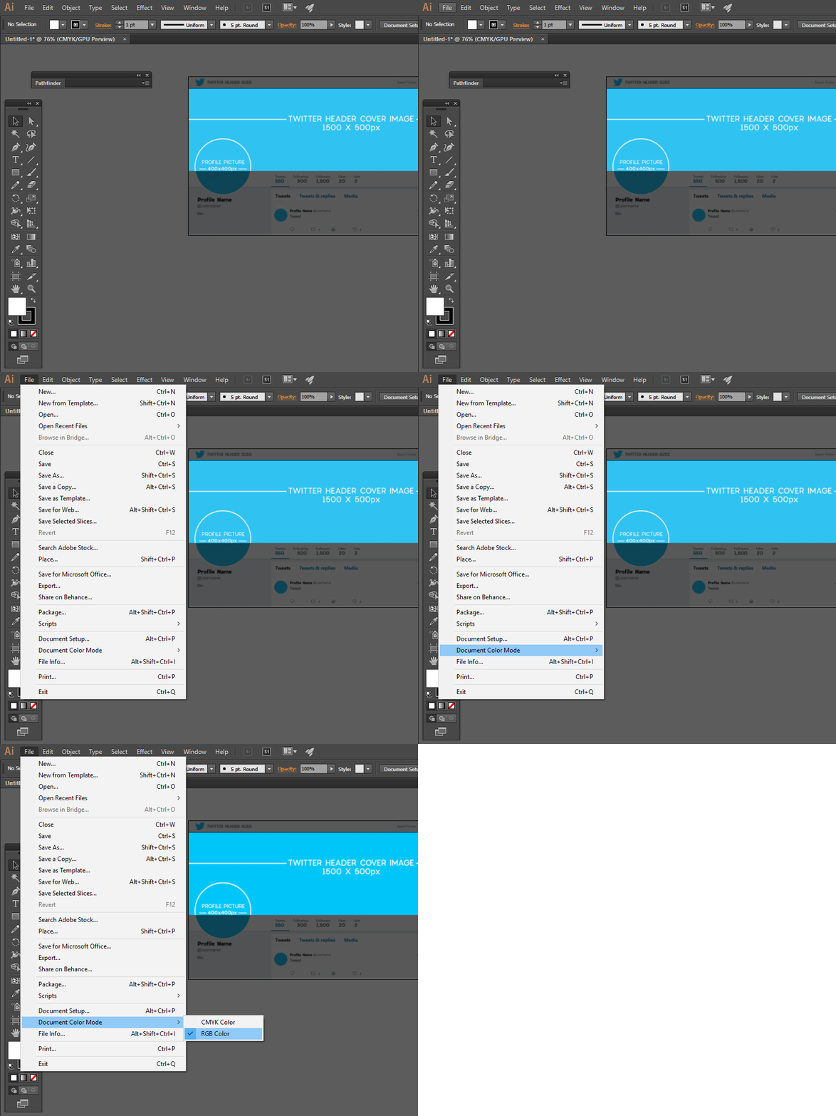
You do not have to worry about the resolution when working on illustrator or vector programs but make sure that you export it in at least 150 dpi and in RGB mode. Most of the time the vector programs that are used for designing print materials are set in CMYK mode. Something to remember, always.
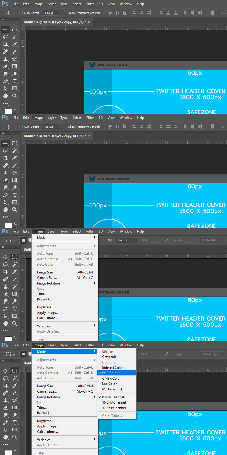
Checking Color Mode in Adobe Photoshop
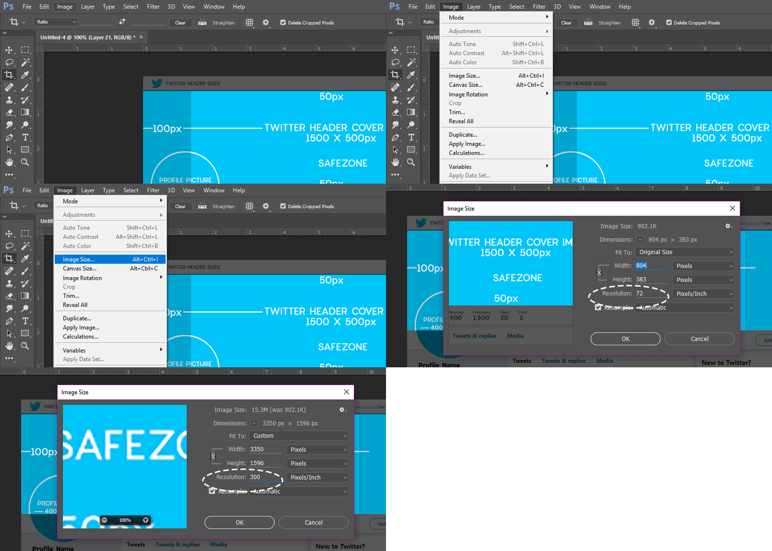
Settings to check mode in Photoshop
Setting to check when you export the image from Illustrator
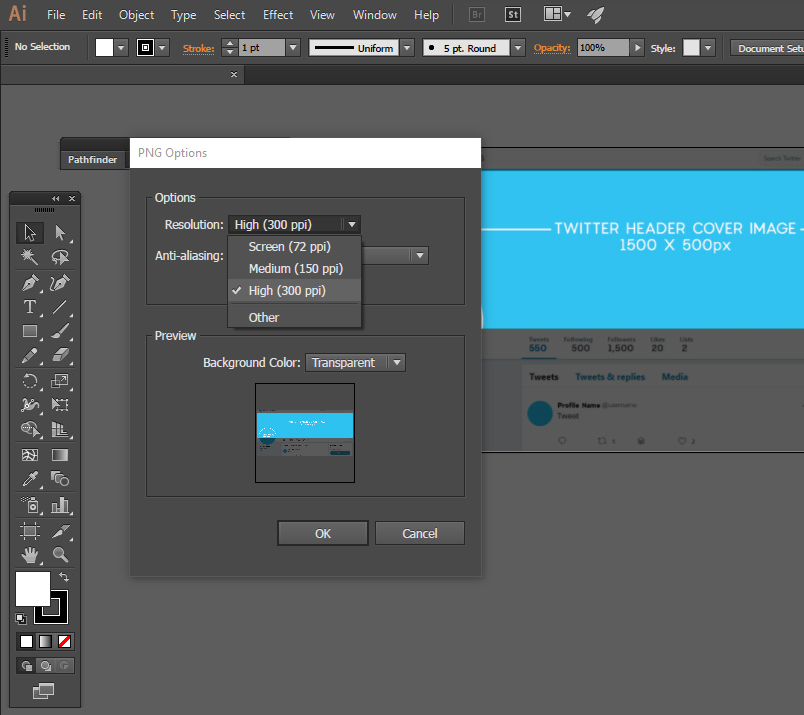
Checking Export Settings in Adobe Illustrator
Another factor that you must remember during the design process is cropping. Twitter crops the top and bottom part of the uploaded header image by almost 50px to 60px respectively from top and bottom.
I know, it’s a headache to check everything and start from scratch, so I have created a set of templates with designs that you can start using right away.
Twitter Header Sizes Template Download
if you like the templates, please share it and tweet about it!
I have also compiled a list of tools that you can use to create Twitter header images from scratch or using the PNG template. I have included in the Downloadable Template File. These tools can be great even when you are on travel and just want to create a quick cover image in the right dimensions.
List of applications for Twitter Cover image creation
3. Canva
Now let’s check out each one of these tools.
1. PicMonkey lets you create images with different frames and effects.
They even have free font types to use in the image-creation process. You can add images, add text, special effects and also resize images at your will. Very useful when creating Twitter header covers as well as other social media visuals.
Here is sign up page for PicMonkey
Check out the creation of a Twitter Cover Banner with PicMonkey.
2. PixTeller can be used to create any type of image online.
You can choose from a wide range of design layouts and create collages with graphics. You can upload images and also use edit wide collection of library items.
Another advantage just like Picmonkey, PixTeller lets you create text overlays with customizable fonts, colors, and styles. You can also enable borders, photo effects, and filters on your image using this tool.
Here is sign up page for PixTeller
3. Canva is an amazing tool that can be used for free.
You can create all kinds of designs and graphics with this tool, from posters to business cards. The availability of different social media image templates makes it a breeze to create amazing social visuals in minutes. It is a lifesaver when you are on the move and need to post an image that doesn’t look like you are posting from the 1990s.
Here is the sign-up page for Canva
4. Powerpoint –Yes, the good old Powerpoint where you create presentations. You can use it to create custom graphics. You will most probably have it on your computer if you are on windows. If you are on Mac, you can use Keynote.
[More design tutorials and templates coming soon for PowerPoint Users]
Saving Files from Image Editing Applications
When saving the file as mentioned before, save in RGB mode and make sure you save in PNG. Settings for optimum resolution in export. Do not even think of compressing your image when exporting from Photoshop as Twitter will compress the image and it will look like a mess. Believe me, been there, and done that. Even though you upload the image in PNG, Twitter will compress and convert it to a JPG.
Another problem with Twitter compression is that Small fonts, watermarked texts, etc. get blurred after the compression. If you are using an image with text, make sure that they are not very small or thin in font style.
Changing your Twitter cover is as easy as always, just click your edit profile link once you are logged in. See the screenshot below:
Again, let me remind you that Twitter WILL let you upload a smaller-resolution image, but NEVER let it fool you. You should always upload an image with at least 1500px width and 500px height. Remember cropping!!!
Updating Your New Twitter Header Sizes
Now you have the new image uploaded and cropped. Click the Apply button and save the changes. Always check the profile after you make a change as browsers don’t respond properly all the time to commands. So make sure your changes are applied properly. If you find something that is not right, just edit the header image again.
Latest Twitter Display Picture Sizes for 2021
The infamous egghead and your brand. I know you are not silly enough to leave your profile picture blank with the default egghead, you are more clever than that for sure if you have found this post. Let us jump right into fixing the display picture and making your profile look more dynamic.
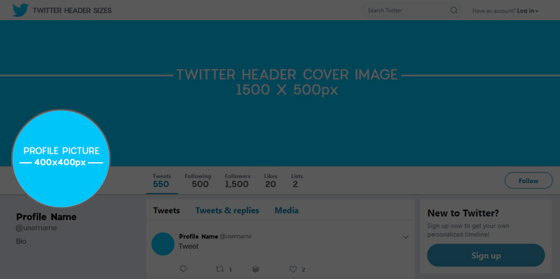
Coming back to our profile, we are reminded of our new Twitter Profile picture. These changes also have been updated is a refreshing change. The new dimensions of the profile picture is 400px X 400px. So basically it’s a square. You can download the template for Photoshop below. The display picture has a white border as shown below. After uploading, you can reposition and zoom the display picture just like the cover image. The maximum image size shouldn’t be more than 2MB.
Twitter Image Upload Guidelines
Even though the Twitter header sizes are responsive, the display picture stays the image on all devices as far as my test can tell. The display picture scales down to different sizes as required, but not scaled up, which is good in terms of avoiding blurred images. Good work Twitter, why don’t you do that for the header? Don’t let us upload low-resolution images for the sake of the world and our brands!
Once you upload, make sure the profile picture and the Twitter cover image go well together. If they do, well and good, and if not, just make the required changes and re-upload again.
In case you don’t upload a header image, you will have a solid color background as per your preset theme color. It is recommended that you have good branding which is consistent throughout your marketing channels.
Importance of Custom Twitter Profile Header
Your Twitter Header Cover and Profile picture is one of the most viewed elements on your profile. This is your first and best chance to create a brand image when a prospect visits your page. They evaluate your brand from the visual experience they receive from your brand’s presence on Twitter if they are touching your brand for the first time.
Make sure that you have your bio section filled out properly as users search your brand or name on Twitter to find just to get some basic information like what your brand is about, your website, services, location, etc.
Even though this post is not about creating a better Twitter profile, I have mentioned optimizing your profile because, without an optimized profile, an amazing cover image or display picture will not bring engagement or followers for long. You can read more about customizing your Twitter Profile here
Increasing Engagement on Your Twitter Profile
If you are on a quest to improve and increase your Twitter traffic, then I would highly recommend “Twitter Traffic Booster” by Igman Baron. He is one of the top Twitter marketing experts I have ever met. I truly admire the quality of his case studies and have been following his courses for a few years now. These case studies are done in real-time and are up-to-date. Here is my complete review of the Twitter Traffic Booster that was released in August 2020.
In ‘Twitter Traffic Booster’ Igman reveals his method through which he got 329,000 Tweet Impressions and 5000 Targeted Followers from scratch in 28 days with several similar results. It’s worth trying out if you are serious about building a brand on Twitter that has engagement.
You can grab a copy of this case study here. You will learn a lot about increasing traffic to your websites from twitter and also how to build very targeted and high-quality followers rather than some bots that are of no good use.
Coming back to our topic of Twitter header sizes, I would like to show you how a new Twitter profile is branded and filled out from scratch. For this tutorial, I will take a fictional brand as usual – [brandname]
Frequently Asked Questions:
Question:I uploaded my image in the mentioned dimensions of 1500px X 500px. I still get a blurry image, why is it so?
Answer: Even if you uploaded the right sizes for the header, you should always make sure that you are exporting the image at the best possible quality. Check the above section on exporting images in Photoshop and Illustrator respectively.
Question:I do not understand how to use the grids and guides in Photoshop for a safe area. How do I get this to work safely?
Answer:I have included a hidden layer named “Safe Area” in the template file for Photoshop and Illustrator. You just need to enable them while working and delete/hide them while exporting your final output in full resolution to keep the content within the safe area.
Question: I do not have Photoshop, how do I use these templates?
Answer: You can use any software to work with these template packs for Twitter. Just download the files, unzip and you can find different file types. In case you do not have any software that is mentioned here, just open the PNG image in MS Paint or gimp. Follow the tutorial below to get the header created according to the latest header size.
Question: Could you recommend some cool Twitter headers?
Answer: Yes, here is a collection of cool Twitter headers in different niches. I have gone the extra mile and added the respective template for the new Twitter header dimensions for these designs. Put them to good use!
Question: Could you show how you can edit the header image on a mobile device?
Answer: Just follow the step-by-step instructions and images below:
Question: I follow the guidelines from Twitter and I still can’t get the header to display properly, will these mentioned sizes work?
Answer: This happens because of the cropping, image resolution, and display picture adjustments. If you follow the guidelines above, there should be no reason for your Twitter Header Cover to be misaligned or displayed incorrectly.
Question: Can I upload GIF images as my Twitter Cover image?
Answer: Yes, you can upload JPEG, JPG, PNG, and GIF but animated GIFs are not supported by Twitter at the moment of writing this post. I would recommend the PNG format.
Question: Does the compression of images by Twitter affect the quality when displayed on the profile? Does it have a major impact?
Answer: Yes, it does affect quality. here you can find two tests that I have done. One for the display picture and the other for the Twitter cover photo.
Question:I am using my Twitter Account for my personal branding, should I use a professional photograph?
Answer: That depends on your goal and your personal branding objectives. In my suggestion, no matter what the objective or style of photo or image you use, never use low-quality or copyrighted images. It just leaves a bad impression on your visitor’s mind about your profile, your brand, and yourself.
Question: I am a designer, should I think of some design principles while designing the cover image?
Answer: Just like any image that you design, make sure that you have a good balance of elements, it is not required to have rules like the rule of thirds or golden ratio or anything complex for a basic cover image. If you are a designer and designing for a brand that has guidelines, please carefully study the usage of the colors, fonts, and ratios between elements. In case you are not aware of the guidelines, always ask for them before you get started to avoid confusion later.
Question:I am using 1500px x 421px over 1500 x 500px, it seems to work. Do I need to change the dimensions to match the new Twitter header sizes?
Answer: I tested it out and 1500px works better.
Question: Where can I get Images for my Twitter Cover?
Answer: You can get free (royalty-free) images and paid stock images. I have compiled a small list below for both:
1. Free Stock Photos
2. Paid Stock Galleries
Question: Can I use icons inside my Twitter profile bio?
Answer: Yes of course, what’s fun on Twitter without emojis? You can use emojis, hashtags, handles, and URLs.
Question: Could you recommend some styles to base my Header images on?
Answer: There are 100s of styles that you can follow according to your brand’s identity, but here are a few that I personally think can be used by anyone, if they do not know where to start the design thinking-process from.
1. Minimalistic
You can keep your cover banner to the bare minimum with solid color, but that might look very boring. Instead, you could create a logo-based watermarked cover image that will suit your brand and will go well with your display picture. Below you can find an example I designed for our imaginary company [company name]
2. Deliver Your Message
Your Twitter cover image is your virtual real estate, put it to good use and deliver your brand’s message. It can be a slogan, headline, or even just conveying a message to your target audience. Always follow the KISS system of Keep it Simple Silly to create elegantly, but powerful messages that can be used on your header. If you have a slogan on your logo and you have to cut it out due to the lack of space in your display picture, you can use the full version of your logo on the cover image.
3. Expose Your campaigns
This space is advertising space as explained before so you can use this space to advertise your marketing campaigns to create more exposure and as you build a larger follower base, the new users will get to know about your products and services the way you want them to.
Below you can find an example I designed for our imaginary company
4. Showcase your products
This is one of my favorite styles. It is obvious that you need to advertise your products but you can not push all your products down the prospect’s throat. At the same time, you will have a pure winner or a product that performs the best in your product catalog, highlight that product on the header. If you have to highlight a product on your header image and you have no idea, look back to your website. What are you highlighting on your website or landing pages? Do you have slides on your product displaying or highlighting a product?
If you still can’t find one, you need to think deeply about your products and services before you plan your promotion on social media.
5. Highlight your USPs
Every player in the market requires a USP to compete with the competition. If your USP is one of those that put you way ahead of your competition, take out that weapon and use it on your Twitter Cover image. This is your brand’s space and put the word out there about your uniqueness and why your customers should choose you over your competitor.
6. Reach Your Audience
An image can convey more than 1000 words and if you have pinned down your ideal customer avatar for your products or brand, then this will be a piece of cake for you. For example, if you have a brand that is about dog food, then you could reach your audience emotionally through an image that conveys the bond between a K9 and his master.
6.Go, Black & White
Yes, Grayscale can be interesting when it comes to Twitter cover images. I have tested a few of them with the blue color scheme. A grayscale header looks soft and subtle with a colorful display picture. You can see an example below:
7. Dark & Bright
No, this is not the same black and white even though it sounds the same, every brand has a color or shades of colors to be precise. You can play with complementary colors or shades of the same brand color to create interesting headers that work well with your branded posts as well as the display picture.
8. Event Highlights
If you have been part of a major industry event or your company took part in a recent tradeshow or event, it would a good choice to highlight your stall, booth, or presence in the event through the header, especially if it’s a major industry event. This will position you being one of the major brands in the industry as you will be sharing a presentation with other industry players.
9. Seasonal Messages & Greetings
It is always better to care for and greet your visitors especially when it is a festive season. You can use the header space to share seasonal greetings with your followers. Here are a few templates based on seasons and festivals to download for major seasons & holidays; you can thank me later!
10. Hashtagification
I am not sure if that word exists, but without taking the pain to do a Google search, I am explaining what it means here. If you are creating a hashtag based on your brand or your Twitter handle, you can just use the tag on the header. Again, this is your virtual real estate, so use it wisely.
Popular Twitter Pages & Their Headers
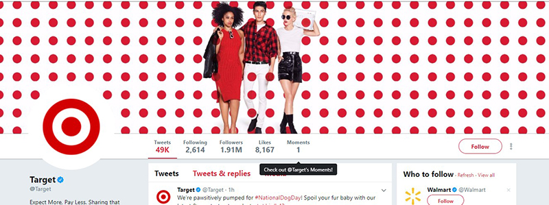
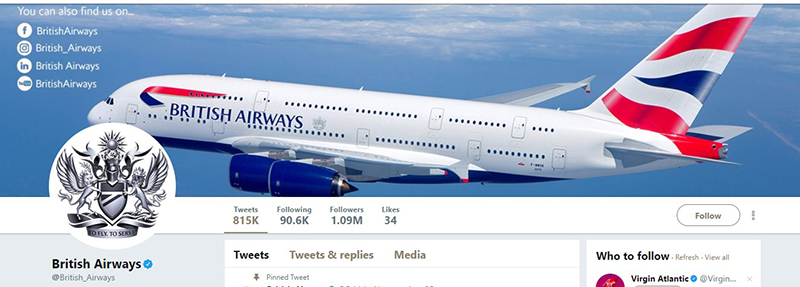
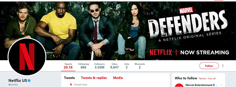
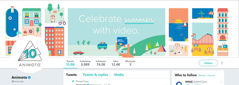
Let’s look at some of the world-famous brands and their Twitter cover image to see if we can identify any of the styles mentioned above and how they look in the new Twitter header sizes.
1. Target
2. British Airways
3. Netflix
4. Animoto
Facts to remember:
1. The new Twitter header sizes are important as they will be cropped by Twitter, the main cover is 1500px X 500px and it’s responsive.
2. The display picture size is 400px X 400px. This is not responsive and stays the same size on all devices.
3. Make sure that you align your content ( logo, face) to the center of your profile picture to avoid being cut from Twitter’s own compress and cropping.
Resources:
Igman Baron’s – Twitter Traffic Booster Case Study.
Downloads:
I hope this post has helped you in understanding the basics of designing and uploading a good-quality profile cover according to the latest Twitter header sizes of 2021. If you have any feedback or questions, please feel free to share them in the comments below.

Top https://shorturl.fm/YvSxU
Very good https://shorturl.fm/TbTre
Good partner program https://shorturl.fm/N6nl1
Very good https://shorturl.fm/bODKa
Cool partnership https://shorturl.fm/a0B2m
Good partner program https://shorturl.fm/N6nl1
Awesome https://shorturl.fm/5JO3e
Good https://shorturl.fm/j3kEj
Very good partnership https://shorturl.fm/9fnIC
Good https://shorturl.fm/j3kEj
Super https://shorturl.fm/6539m
Very good https://shorturl.fm/bODKa
Very good https://shorturl.fm/bODKa
Share, refer, and watch your profits grow! https://shorturl.fm/9fnIC
https://shorturl.fm/9fnIC
https://shorturl.fm/5JO3e
https://shorturl.fm/YvSxU
https://shorturl.fm/TbTre
https://shorturl.fm/6539m
https://shorturl.fm/m8ueY
https://shorturl.fm/a0B2m
https://shorturl.fm/9fnIC
https://shorturl.fm/a0B2m
https://shorturl.fm/N6nl1
https://shorturl.fm/FIJkD
https://shorturl.fm/bODKa
https://shorturl.fm/6539m
https://shorturl.fm/5JO3e
https://shorturl.fm/68Y8V
https://shorturl.fm/5JO3e
https://shorturl.fm/N6nl1
https://shorturl.fm/xlGWd
https://shorturl.fm/Kp34g
https://shorturl.fm/nqe5E
https://shorturl.fm/uyMvT
https://shorturl.fm/PFOiP
https://shorturl.fm/f4TEQ
https://shorturl.fm/PFOiP
https://shorturl.fm/f4TEQ
I just could not depart your web site prior to suggesting that I really loved the usual info an individual supply in your visitors Is gonna be back regularly to check up on new posts
OVI regulations over Ohio might be complex, while it’s crucial to have got a great understanding of themselves if yourself are facing expenses. Operating below the actual influence (DUI) happens to be a grave offense that will can have actually substantial ramifications on some future. In Ohio, that lawful limit for blood flow alcohol concentration (BAC) is 8%for some motorists and four per cent business chauffeurs.
If you are stopped by legal security services and accused of driving under the influence, they could make field soberness assessments or chemical studies, this type of because breathalyzer or bloodstream reports, to establish the level of damage. Refusing most of these tests can result in automatic penalties, including driving license suspension.
driving under the influence criminal acts in Ohio bear multiple penalties, based on variables such as last prosecutions, BAC quality, plus irrespective of whether recently there was basically an crash or personal injury required. Results might add penalties, license pause, mandatary alcohol in the mouthwash remedies tools, test period, and truly penitentiary time. Residual offenses and angry circumstances can result in more bad penalties.
Possessing a experienced DUI barrier attorney is vital to manage the complications of Ohio drunk driving regulations. They lavatory examine the proof of, fight the legality of the leave, concern the consistency of studies, and enjoy prospective defenses to help abate the rates. Further, an law firm can guide you thru the professional process, producing your own legal rights are preserved and urge for the greatest a possibility result.
Remember, being aware with regards to Ohio’s DUI statutes and attempting the support of an encountered personal injury attorney are required steps in effectively dealing with a DUI rate as well as saving ones forthcoming future. credit card fraud lawyer
fast payday loan is a fast and hassle-free way to secure the funds you need. With a simple application process, you can get loans online from the comfort of your home, avoiding lengthy paperwork. Online lenders offer competitive rates and quick approvals, ensuring you receive the money promptly. Experience the convenience and efficiency of getting loans online and meet your financial needs with ease.
Hey everyone,
This thread is for anyone who has played at 1win Casino to share their honest feedback and experiences. With so many online casinos out there, it can be tough to know which ones are worth your time and money.
I’m thinking of trying out 1win and I’m curious to hear from the community. I’ve seen some mixed reviews online, so I’m hoping we can create a helpful discussion for new and existing players.
To get the conversation started, here are a few questions:
What has been your overall experience with 1win? (e.g., excellent, good, average, poor)
Game Selection: What do you think of their variety of slots, table games, and live dealer options? Any favorite games?
Bonuses and Promotions: Are their bonus offers fair and easy to understand? Have you had any success with them?
Deposits and Withdrawals: How smooth is the process for depositing and withdrawing funds? Have you faced any issues with verification or payout times?
Customer Support: Have you ever needed to contact their support team? How responsive and helpful were they?
Website and App: How do you find the user interface and overall usability of their platform?
Whether you’ve had a big win, a frustrating experience with a withdrawal, or just want to share your general thoughts, please post them here. Let’s help each other out by creating a transparent and honest resource for everything related to 1win Casino.
Приглашаем посетить наш интернет магазин https://misterdick.ru/ по
продаже дженериков в Москве с быстрой доставкой по МСК в день заказа.
Высокое качество дженериков производства Индии в наличии для покупки.
Так же отправляем заказы во все регионы почтой России
This guide is a game changer! The PSD templates are super helpful, and I appreciate the clear breakdown of sizes. It’s so important to keep our Twitter profiles looking sharp, and this post makes it easy. Thanks, Hari!
Приглашаем узнать : остекление в Екатеринбурге окна в Екатеринбурге о теплом и холодном остеклении объектов. безрамное остекление .
Сайт Kraken – лучший магазин моментальных покупок в Darknet
Сервис Кракен – лучший магазин в Даркнете, где продаются разные ПАВ, поддельные банкноты, паспорта и удостоверения, предлагается взлом сайтов и пробив информации. Посетителям обеспечивается полная анонимность, а количество магазинов всё время растёт.
Покупки на Кракене
В магазинах сервиса можно найти такие товары и услуги:
• Несколько видов наркотиков – от травки и мета до опиатов и психоделиков.
• Обналичка Биткоинов.
• Взломанные аккаунты VPN-сервисов.
• Услуги хакеров.
• Разные виды документов.
• Банковские карты и симки.
• Фальшивые купюры – обычно – от 1000 до 5000 рублей.
• Приборы и устрйоства – от скрытых камер и жучков до флешек для взлома.
На сайте можно и заработать. Например, стать курьером или кладменом, варщиком или гровером. Можно самому продавать препараты и другие товары.
Несколько плюсов сайта
Причины для выбора площадки Kraken:
• Полная анонимность клиентов и владельцев магазинов за счёт расположения в «луковой сети».
• Использование BTC для совершения сделок. Оплата Биткойнами обеспечивает анонимность всех транзакций.
• Доступ к покупке не дожидаясь доставки. Клады уже доставлены – зная адрес, можно забирать.
• Минимальный риск мошенничества. Проблемы решаются обращением в техподдержку, которая работает круглосуточно.
• Система рейтинга, которая позволяет легко определить лучшие магазины.
• Доставка в разные города России и СНГ. Перечень городов содержит даже небольшие населённые пункты.
Пользователям Кракена доступны бесплатные дополнительные услуги. Круглосуточно они могут получить консультацию у юриста или нарколога. А при появлении проблем – связаться с поддержкой, работающей в любое время.
Дополнительный плюс площадки – наличие своего форума. Вход из расположенной вверху панели сервиса. На форуме есть основные правила, новости и информация от других посетителей. А ещё результаты администрации проекта и школа кладменов для обмена опытом закладчиков.
Как перейти на Кракен
Площадка, который продаёт запрещённые препараты и фальшивки всех видов, блокируется государственными службами. Потому попасть сюда, просто перейдя по ссылке не выйдет. Для этого следует использовать зеркало, Tor или VPN-сервис.
Сервис ВПН – вариант, вариант, позволяющий заходить на заблокированный ресурс. Например – на площадки в Darknet. Преимущество метода – защита связи, возможность изменения IP только в браузере или для ПК. Недостатки – замедление скорости и небольшой размер бесплатного трафика.
Ещё один вариант – специальный браузер Tor. Чтобы зайти на Кракен понадобится специальная ссылка, заканчивающейся на .ONOION. Достоинства программы – бесплатное использование и луковичная маршрутизация, скрытый IP и отсутствующая история посещений. Минус – замедление скорости.
Зеркала сайта – аналог страницы, но расположенный в другом месте. Отсутствуют отличия от настоящей Кракена. Есть возможность запуска из любого браузера. Зеркальные версии работают, даже если временно недоступен сервис Kraken. Минус – трафик не скрывается, а пользователь в поисках зеркала может перейти на фальшивую страницу. Потому список зеркальных версий следует брать на надёжных сайтах. Есть такой перечень на самом Кракен и тематических форумах.
Регистрация
Для использования площадки нужно пройти регистрацию. Это позволит покупать товары, пользоваться форумом, общаться с техподдержкой, наркологом или юристом. Для регистрации от пользователя требуются такие действия:
1. Перейти по правильной ссылке на площадку и ввести капчу.
2. В регистрационной форме указать все идентификаторы для входа. Логин – английскими литерами. Имя вводится и на русском.
3. Закончить процедуру регистрации и согласиться с правилами сайта.
После того как посетитель зарегистрирован идентификаторами можно пользоваться чтобы заходить в аккаунт. В нём находится информация о заявках и оплате, скидках, можно настроить двухфакторную аутентификацию.
Как совершить покупку на сервисе Kraken
Совершить покупку на площадке можно за несколько простых шагов:
1. Выбрать город в списке. По умолчанию там стоит место, указанное при регистрации. Можно указать метро и район города.
2. Найти нужную категорию в меню слева. Выбрать желаемый способ доставки – клад, магнит, прикоп.
3. Познакомиться со списком продавцов. Выбрать нужный товар и перейти на его страницу.
4. Прочитать описание и отзывы. Если всё нормально – перейти к покупке.
5. После перехода к форме заказа указать подходящий вариант. Например, криптовалюту, банковскую картуы, пополнение счёта или рулетка.
6. Узнать расположение закладки и забрать покупку в нужном городе и районе.
7. Оставить отзыв о продавце, чтобы другие посетители знали, что магазин надёжный – или были проблемы.
8. Запомнить магазин в «Избранное» чтобы было проще заходить из профиля.
Делая покупки, стоит знать несколько правил. При появлении проблем клиент может открывать с продавцами споры с участием администрации. Первая покупка совершается только за Bitcoin. При выборе рулетки, открывается доступ к игре. Это даёт шанс заплатить меньше, угадывая числа на поле из 100 клеток. Другой способ уменьшить сумму к оплате – промокод. Он подходит для оплаты только 50процентов стоимости товара.
Гарантии качества товаров и услуг
Обращение на Кракен позволяет рассчитывать на качество продукта. Убедить покупателей, что вещества соответствуют требованиям сайта, продавец может, получив сертификат. При прохождении проверки данные об этом показываются в карточке.
Ещё одна гарантия – подтверждение покупки в течение суток. Если клад на месте, сделка закрывается. При появлении проблем – открывается спор с участием админов. Если доказана вина магазина, деньги возвращаются покупателю. У владельца товара снижается рейтинг, а постоянное мошенничество может привести уходу с ресурса. Поэтому некачественного товара на Кракене почти не бывает
Your network, your earnings—apply to our affiliate program now! https://shorturl.fm/gFgQZ
Start earning on every sale—become our affiliate partner today! https://shorturl.fm/7eK8l
Share our products, reap the rewards—apply to our affiliate program! https://shorturl.fm/YWbjH
Step into the electrifying world of online casinos, where every spin ignites anticipation and fortune! New players are offered fantastic welcome bonuses, like 50 free spins just for joining, while welcome bonuses as high as 200% boost your start, as seen at Vavada. Experience free play in demo mode, trying out dynamic slots from NetEnt or roulette strategies without risking anything. Reward programs and free spins add an exciting edge, enhancing your gaming adventure. Always check the bonus wagering terms and enjoy safe gambling on reputable platforms! https://is.gd/11vd7E
Refer and earn up to 50% commission—join now! https://shorturl.fm/yPoQZ
Refer and earn up to 50% commission—join now! https://shorturl.fm/NtRNn
Join forces with us and profit from every click! https://shorturl.fm/TSdvr
Turn referrals into revenue—sign up for our affiliate program today! https://shorturl.fm/h6yTH
Partner with us and earn recurring commissions—join the affiliate program! https://shorturl.fm/V5pmt
Get rewarded for every recommendation—join our affiliate network! https://shorturl.fm/FUSUN
Become our partner and turn clicks into cash—join the affiliate program today! https://shorturl.fm/hyC9b
Join our affiliate program today and earn generous commissions! https://shorturl.fm/KXjcD